

Chapter 1: Introduction to WordPress Themes and CSS
The Importance of CSS in WordPress Themes
CSS (Cascading Style Sheets) plays a crucial role in WordPress themes, determining the visual appearance and layout of your website. Understanding the importance of CSS and its role in WordPress is vital for web developers, as well as newbies who own websites and are looking to fix CSS issues in their WordPress themes. In this subchapter of “CSS Solutions for WordPress Themes: A Comprehensive Guide,” we will delve into why CSS is essential and how it can help you create visually stunning and functional websites.
One of the primary reasons CSS is important in WordPress themes is its ability to separate content from design. By using CSS, you can apply consistent styles and formatting across your entire website, making it easier to maintain and update. With CSS, you can control the font styles, colors, spacing, and layout of your website, ensuring a cohesive and professional look.
Additionally, CSS allows you to customize your WordPress themes to reflect your brand or personal style. Whether you are a web developer working on a client’s website or a newbie web owner creating your own site, CSS empowers you to create unique and visually appealing designs. By modifying the CSS code, you can change the background, typography, buttons, and other elements to match your desired aesthetic.
Furthermore, CSS is essential for responsive web design, which is crucial in today’s mobile-driven world. With CSS media queries, you can optimize your WordPress themes to adapt and display correctly on different devices, such as smartphones and tablets. This ensures a seamless user experience across various screen sizes, enhancing accessibility and user engagement.
For web developers, understanding CSS is essential for troubleshooting and fixing CSS issues that may arise in WordPress themes. Whether it’s a misaligned element, a broken layout, or an issue with the responsiveness, having a strong grasp of CSS will enable you to diagnose and rectify these problems efficiently. This subchapter will provide you with practical solutions and best practices for tackling common CSS issues in WordPress themes.
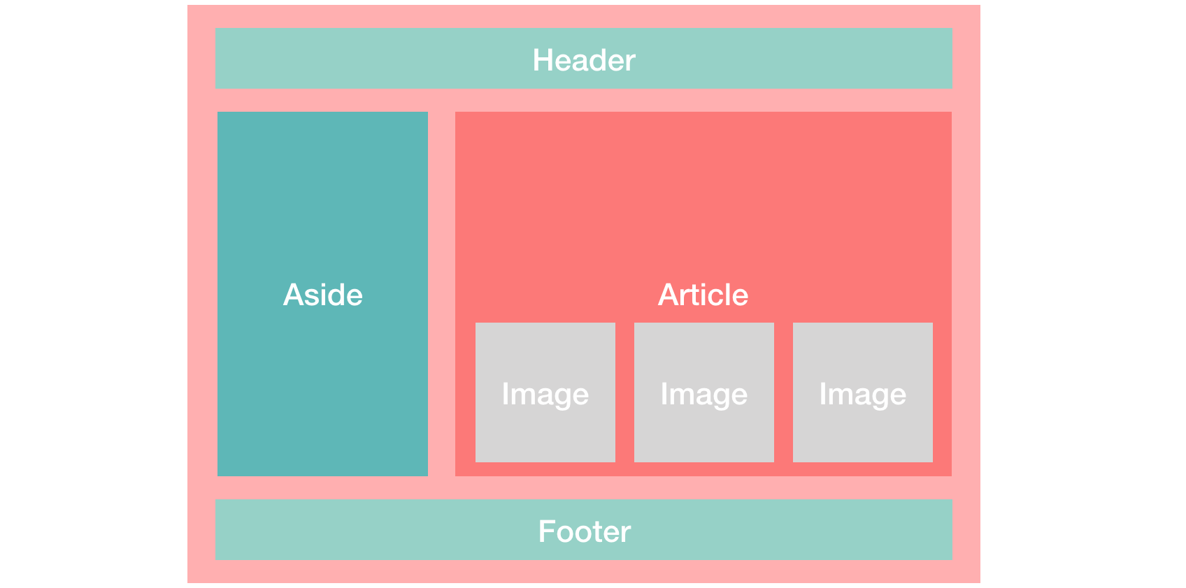
Understanding the Structure of a WordPress Theme
In order to effectively fix WordPress theme CSS issues, it is crucial to have a thorough understanding of the structure of a WordPress theme. This chapter will provide web developers and newbie web owners with a comprehensive guide to the inner workings of a WordPress theme, enabling them to identify and resolve CSS problems efficiently.
A WordPress theme is essentially a collection of template files that control the appearance and functionality of a website. These template files are organized in a hierarchical structure, allowing for easy customization and flexibility. At the root level, we have the main stylesheet file, style.css, which contains the CSS rules that define the overall appearance of the theme.
Moving further, we encounter template files such as header.php, footer.php, and sidebar.php, which handle the respective sections of a web page. These files are used to maintain consistency across different pages of a website. Understanding the structure and purpose of these template files will help in pinpointing and fixing CSS issues related to specific sections.
Additionally, a WordPress theme includes other essential template files like index.php, single.php, and page.php, which determine the layout and styling of individual posts and pages. These files are responsible for rendering the content in a structured manner and can often be the source of CSS problems.
Furthermore, WordPress allows for the creation of custom template files, such as archive.php and search.php, which control the display of category archives and search results, respectively. Familiarity with these files is crucial for resolving CSS issues specific to these functionalities.
Finally, a WordPress theme may incorporate various additional files, such as functions.php, which contains PHP functions and custom code that enhance the theme’s functionality. Understanding the role of these files will enable web developers to identify and address CSS issues that arise from customizations or modifications made in these files.
By comprehending the structure of a WordPress theme, web developers and newbie web owners can troubleshoot and resolve CSS issues effectively. A solid understanding of the template files and their purpose empowers them to locate the source of the problem and make targeted changes to the CSS code. With this knowledge, they can ensure their WordPress themes are visually appealing, functionally efficient, and offer a seamless user experience.
Common CSS Issues in WordPress Themes

In the world of web development, creating visually appealing and functional WordPress themes requires a deep understanding of CSS. However, even experienced web developers often encounter common CSS issues while working with WordPress themes. This subchapter aims to address these issues and provide effective solutions to help web developers and newbie website owners fix CSS problems in their WordPress themes.
One common issue is the lack of responsiveness in WordPress themes. With the increasing use of mobile devices, it is crucial for websites to be responsive and adapt to different screen sizes. This chapter will guide readers on how to identify and fix responsiveness issues by utilizing CSS media queries and making necessary adjustments to ensure a seamless user experience across all devices.
Another common CSS issue in WordPress themes is the misalignment of elements. Whether it’s text, images, or buttons, misaligned elements can make a website look unprofessional and disjointed. This subchapter will provide step-by-step instructions on using CSS techniques such as flexbox and grid to align elements properly and create a visually pleasing layout.
Inconsistent font styles and sizes can also pose a challenge in WordPress themes. This chapter will delve into the different methods to achieve consistent typography throughout a website, including the use of CSS resets, custom classes, and Google Fonts. Readers will learn how to customize font styles and sizes to match their desired aesthetic and maintain consistency across all pages.
Furthermore, this subchapter will address the issue of browser compatibility. Different browsers interpret CSS code differently, leading to inconsistencies in the appearance of a website. Readers will discover techniques to identify and resolve browser-specific CSS issues, including vendor prefixes, fallback properties, and CSS hacks.
Lastly, this chapter will cover the problem of slow-loading WordPress themes. Bloated CSS files and unnecessary code can significantly impact a website’s performance. Readers will learn how to optimize CSS code by removing unused styles, minifying code, and utilizing caching techniques to improve loading times and enhance overall user experience.
Whether you’re a seasoned web developer or a newbie website owner, this subchapter will provide valuable insights and practical solutions to common CSS issues in WordPress themes. By mastering these techniques, you’ll be able to fix CSS problems efficiently, ensuring your WordPress themes are visually appealing, responsive, and user-friendly.
Chapter 2: CSS Fundamentals for WordPress Themes
CSS Syntax and Selectors
In the world of web development, Cascading Style Sheets (CSS) play a crucial role in styling and designing websites. Whether you are a seasoned web developer or a newbie web owner, having a solid understanding of CSS syntax and selectors is essential for fixing WordPress theme CSS issues. This subchapter will guide you through the fundamental aspects of CSS syntax and selectors, providing you with the necessary knowledge to troubleshoot and enhance your WordPress themes.
CSS syntax refers to the structure and rules that govern how CSS code is written. It is crucial to follow the correct syntax to ensure that your stylesheets are interpreted and applied correctly by web browsers. This chapter will break down the different components of CSS syntax, including selectors, properties, and values. You will learn about the importance of using proper indentation, semicolons, and curly brackets to organize and structure your code efficiently.
Selectors are a fundamental part of CSS that allow you to target specific HTML elements and apply styles to them. This chapter will explain the various types of selectors, such as element selectors, class selectors, ID selectors, and pseudo-selectors. You will understand how to use these selectors effectively to style specific elements or groups of elements within your WordPress themes.
Additionally, this chapter will cover advanced selectors like attribute selectors, child selectors, and descendant selectors. These selectors provide you with even greater control over the styling of your WordPress themes, allowing you to target elements based on their attributes or relationships to other elements. Understanding and utilizing these advanced selectors will empower you to fix complex CSS issues and achieve precise styling results.
By mastering CSS syntax and selectors, you will gain the skills needed to tackle common CSS problems in WordPress themes. Whether you are dealing with layout inconsistencies, font styling issues, or responsive design challenges, a strong foundation in CSS syntax and selectors is the key to finding effective solutions.
Whether you are a web developer seeking to enhance your CSS skills or a newbie web owner wanting to fix CSS issues in your WordPress themes, this chapter will provide you with the knowledge and tools necessary to navigate CSS syntax and selectors confidently. With a solid understanding of these fundamental concepts, you will be well-equipped to create visually stunning and functional WordPress themes.
CSS Properties and Values
In the world of web development, CSS (Cascading Style Sheets) plays a vital role in shaping the visual appearance of websites. Whether you’re a seasoned web developer or a newbie web owner, understanding CSS properties and values is crucial for creating and fixing WordPress theme CSS issues effectively. In this chapter, we will explore the fundamental CSS properties and values that will empower you to enhance the style and functionality of your WordPress themes.
CSS properties define how certain elements on a webpage should be displayed. These properties control various aspects such as font size, color, positioning, margins, and more. Learning these properties will allow you to customize your WordPress themes to suit your unique design requirements. We will cover some essential properties like font-family, color, background-image, margin, padding, and display, among others.
Font-family property determines the typeface used for text on your website. By specifying a font-family value, you can create a consistent typography style that aligns with your brand identity. We will delve into the different font options and how to implement them effectively.
Color property enables you to define the color of text, backgrounds, and other elements. We will explore various color formats and techniques to choose the perfect color scheme for your WordPress theme.
Background-image property lets you add captivating visuals to your website. You will discover how to use this property to incorporate stunning images or patterns into your WordPress themes, enhancing the overall visual appeal.
Margin and padding properties control the spacing between elements on a webpage. Understanding how to use these properties effectively will allow you to achieve a clean and organized layout for your WordPress themes.
Display property determines how elements are positioned and displayed within a webpage. We will discuss the different display values and how they impact the layout of your WordPress themes.
By familiarizing yourself with these CSS properties and values, you will gain the necessary skills to fix CSS issues in your WordPress themes. Whether it’s aligning text, adjusting spacing, or changing colors, this chapter will provide you with the knowledge and tools to overcome common CSS challenges.
CSS Box Model and Layout
Understanding the CSS Box Model and layout is crucial for web developers, especially for those dealing with WordPress theme CSS issues. In this chapter, we will delve deep into the concept of the CSS Box Model, its properties, and how it affects the layout of your WordPress themes.
- The CSS Box Model is the foundation of every element on a webpage. It consists of four main components: content, padding, border, and margin. Each of these components plays a significant role in determining the overall size and positioning of an element.
- The content area represents the actual content contained within an element, such as text, images, or videos. It is surrounded by the padding, which creates space between the content and the border. The border, as the name suggests, is a line that surrounds the content and padding, providing a visual separation. Finally, the margin is the space between the border and other elements on the page.
- Understanding and manipulating these components is essential when fixing WordPress theme CSS issues. Often, improper box model calculations can lead to misalignment, overflowing content, or unwanted spacing. By mastering the box model, you can ensure that your WordPress themes display correctly across different devices and browsers.
- Furthermore, this chapter will cover various CSS properties that allow you to control the box model and layout of your WordPress themes. We will explore properties like width, height, padding, border, and margin, providing practical examples and use cases.
- Additionally, we will discuss the different layout techniques in CSS, such as the traditional float-based layout, the newer flexbox layout, and the powerful CSS Grid layout. Understanding these layout techniques will enable you to create responsive and visually appealing WordPress themes.
- Whether you are a seasoned web developer or a newbie web owner, mastering the CSS Box Model and layout is essential for creating and fixing WordPress theme CSS issues. By the end of this subchapter, you will have a solid understanding of how to manipulate the box model, utilize CSS properties effectively, and create stunning layouts for your WordPress themes.
Join us on this journey as we unravel the mysteries of the CSS Box Model and layout, and empower you to become a proficient CSS developer for WordPress themes.
Responsive Design and Media Queries

In today’s digital era, where the majority of internet users access websites through various devices, it is crucial for web developers and novice web owners to understand the concept of responsive design and media queries. With the increasing popularity of smartphones, tablets, and other mobile devices, it is essential to ensure that your WordPress theme is optimized for different screen sizes and resolutions. This subchapter will delve into the world of responsive design and media queries, providing you with comprehensive insights and practical solutions to fix CSS issues in your WordPress themes.
Responsive design is an approach that allows websites to adapt and respond to the user’s device, screen size, and orientation. It ensures that your website looks and functions flawlessly across all devices, offering an optimal user experience. Gone are the days when websites were designed solely for desktop computers. With responsive design, your WordPress theme will automatically adjust its layout, font sizes, images, and other elements to fit different screen sizes, ensuring that your content remains accessible and visually appealing.
Media queries play a significant role in achieving responsive design. They are CSS rules that target specific screen sizes or devices, enabling you to customize the appearance and behavior of your website based on different breakpoints. By using media queries, you can set specific CSS rules for smartphones, tablets, and desktops, ensuring that your WordPress theme looks perfect on every device.
In this chapter, we will explore various techniques and tools to implement responsive design and media queries effectively. We will guide you through the process of identifying and fixing common CSS issues that may arise when making your WordPress theme responsive. You will learn how to create fluid layouts, manage breakpoints, handle images and media, and optimize the performance of your responsive website.
Whether you are a seasoned web developer or a newbie web owner, this chapter will equip you with the knowledge and skills to tackle CSS issues in your WordPress themes and create visually stunning and user-friendly websites. By mastering responsive design and media queries, you will ensure that your WordPress themes are future-proof and ready to adapt to the ever-evolving landscape of digital devices and technologies.
Chapter 3: Troubleshooting CSS Issues in WordPress Themes
Inspecting and Debugging CSS with Browser Developer Tools
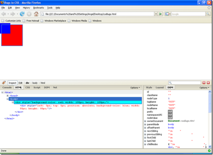
Inspecting and debugging CSS with browser developer tools is an essential skill for web developers and newbie web owners when it comes to fixing WordPress theme CSS issues. In this chapter, we will explore the powerful capabilities of browser developer tools that can assist you in identifying and resolving CSS-related problems.
- Browser developer tools, such as those found in Google Chrome, Firefox, or Safari, provide a range of features that allow you to inspect and manipulate the HTML and CSS of a webpage in real-time. These tools are indispensable when it comes to understanding how CSS is applied to your WordPress theme and pinpointing any issues that might be causing layout or styling problems.
- To begin, we will walk you through the process of accessing the developer tools in popular browsers. Once you have them open, we will show you how to inspect and navigate the HTML structure of your WordPress theme. This will enable you to identify the specific elements and classes that you need to target when making CSS adjustments.
- Next, we will delve into the CSS inspector feature, which allows you to view and modify the CSS rules that are applied to different elements. You will learn how to identify which CSS properties are overriding others, providing valuable insights into why certain styles may not be rendering correctly.
- Furthermore, we will cover the various ways you can experiment with CSS modifications directly within the browser developer tools. This includes live editing of CSS properties, adding new styles, or disabling existing rules temporarily to see the impact on your webpage. These techniques can be incredibly helpful in troubleshooting and finding the optimal CSS solutions for your WordPress theme.
- Additionally, we will explore the network panel within the developer tools, which provides valuable information about the loading and rendering process of CSS files. This knowledge will help you identify any errors or delays in the CSS loading process, allowing you to address them effectively.
By the end of this subchapter, you will have a solid understanding of how to use browser developer tools to inspect and debug CSS issues in your WordPress theme. Armed with this knowledge, you will be better equipped to fix any layout or styling problems that may arise, ultimately enhancing the overall appearance and functionality of your website.
Identifying Specific CSS Issues in Themes

As a web developer or a newbie web owner, one of the most common challenges you may face is dealing with CSS issues in WordPress themes. These issues can range from minor layout problems to major design inconsistencies that can negatively impact the overall user experience of your website. In this subchapter, we will explore various techniques and tools to help you identify and fix specific CSS issues in your WordPress themes.
- The first step in resolving CSS issues is to accurately identify them. This requires a keen eye for detail and an understanding of how CSS properties and selectors work. You need to thoroughly analyze your website’s layout and appearance to spot any discrepancies. This could involve inspecting elements using browser developer tools, comparing the website’s design with the theme’s demo, or seeking feedback from users or peers.
- Once you have identified a CSS issue, the next step is to isolate it. This can be done by disabling unnecessary plugins, custom code, or third-party scripts that might interfere with your theme’s CSS. By simplifying your website’s environment, you can focus on the specific issue at hand and troubleshoot it effectively.
- To delve deeper into the problem, you can leverage browser developer tools. These tools allow you to inspect individual elements, view applied CSS styles, and experiment with changes in real-time. You can modify CSS properties, add or remove classes, and observe the impact on your website. Browser developer tools are an invaluable resource for understanding how different CSS rules interact and can help pinpoint the root cause of a specific issue.
- Another useful technique is to compare your theme’s CSS code with established best practices. By reviewing industry standards and guidelines, you can identify any deviations or outdated practices that may be causing issues. Websites and resources dedicated to CSS troubleshooting, such as Stack Overflow or CSS-Tricks, can provide valuable insights and solutions for common CSS problems.
- Additionally, consider using CSS validation tools to ensure your code meets the W3C standards. These tools can highlight any syntax errors or invalid CSS properties that may be causing issues. Fixing these errors will not only resolve the immediate problem but also help maintain a clean and efficient codebase.
Fixing Layout and Alignment Problems

One of the most common challenges faced by web developers and newbies web owners is dealing with layout and alignment issues in WordPress themes. These problems can arise due to various reasons such as conflicting CSS rules, improper use of HTML tags, or even errors in the theme’s code. In this subchapter, we will explore some effective solutions to address these issues and ensure a visually appealing and well-structured website.
To begin with, it is crucial to understand the importance of maintaining a consistent layout across different devices and screen sizes. Responsive web design has become a standard practice, and it involves creating layouts that adapt seamlessly to various screen resolutions. By utilizing CSS media queries, you can easily target specific screen sizes and apply appropriate styling to ensure optimal viewing experience for your users.
Another common issue that often arises is misaligned elements within a layout. This can be caused by incorrect sizing or positioning of elements, inconsistent margins or paddings, or even missing CSS properties. By using CSS flexbox or grid layouts, you can easily create flexible and responsive designs, ensuring that all elements align properly regardless of screen size or orientation.
Furthermore, it is essential to familiarize yourself with the box model concept in CSS. Understanding how padding, margins, and borders affect the dimensions and spacing of elements will help you resolve alignment issues effectively. By adjusting these properties carefully, you can achieve pixel-perfect layouts that appear precisely as intended.
In addition to layout and alignment problems, typography can also play a significant role in the overall appearance of your website. Ensuring consistent font sizes, line heights, and spacing between elements can greatly enhance the readability and visual appeal of your content. By utilizing CSS units such as em, rem, or percentages, you can create typography that scales appropriately across different devices.
Finally, it is worth mentioning the importance of testing and debugging your CSS solutions. Browser developer tools, such as Chrome DevTools or Firefox Developer Edition, offer powerful features that allow you to inspect and modify your website’s CSS in real-time. By using these tools, you can identify and fix any layout or alignment issues efficiently.
By following the techniques and tips outlined in this chapter, web developers and newbies web owners can effectively tackle layout and alignment problems in WordPress themes. Whether it’s ensuring responsive layouts, fixing misaligned elements, or creating visually appealing typography, mastering these CSS solutions will undoubtedly contribute to a comprehensive and visually stunning website.
Resolving Typography and Font Issues
Typography and font play a vital role in creating visually appealing and user-friendly websites. However, when it comes to WordPress themes, typography and font issues can sometimes arise, causing frustration for both web developers and newbie web owners. In this subchapter, we will explore common typography and font problems in WordPress themes and provide effective solutions to resolve them.
- One of the most common issues faced by web developers and newbie web owners is the inconsistent rendering of fonts across different browsers and devices. This can make your website look unprofessional and compromise the user experience. To tackle this issue, it is essential to use web-safe fonts or include font files in your theme’s CSS. By using web-safe fonts, you ensure that your desired typography will be displayed consistently across various platforms. Additionally, integrating font files into your theme’s CSS allows you to use custom fonts without relying on external sources.
- Another typography-related problem is improper line spacing, which can make the content difficult to read. To address this issue, it is crucial to set appropriate line heights in your CSS. This ensures that text lines are adequately spaced, enhancing readability and overall user experience. Additionally, adjusting letter spacing and word spacing can further improve the legibility of your content.
- Web developers and newbie web owners often encounter font size inconsistencies, where headings or paragraphs appear too small or too large on different pages or devices. To overcome this issue, it is recommended to use relative font units, such as em or rem, instead of fixed pixel values. This allows the font sizes to adapt dynamically based on the user’s device or browser settings, ensuring consistent and responsive typography.
Furthermore, some WordPress themes may lack options for font customization, limiting your ability to achieve the desired typography. In such cases, you can utilize CSS overrides to modify the font attributes selectively. This approach empowers web developers to make precise changes to font styles, sizes, or weights, providing greater control over the overall aesthetics of the website..
Handling Image and Media Display Problems
Images and media are crucial elements in web design that enhance the visual appeal and engagement of a website. However, they can sometimes cause display issues, especially when it comes to WordPress themes. In this chapter, we will explore common image and media display problems and provide effective CSS solutions to address them.
One of the most common issues web developers and newbie web owners face is distorted or stretched images. This occurs when an image does not fit properly within its designated container, resulting in an unappealing and unprofessional appearance. To fix this problem, you can use CSS to set the image’s width and height to specific dimensions, ensuring it fits perfectly within its container without distorting the aspect ratio. Additionally, using the “object-fit” property in CSS allows you to control how the image is displayed within its container, whether it is scaled, cropped, or positioned.
Another issue that often arises is the misalignment of images and media within a WordPress theme. This can occur when different media elements are not properly aligned with each other or with the surrounding content. To resolve this, CSS offers several alignment properties such as “text-align” and “vertical-align” that can help you position images and media elements precisely where you want them.
Furthermore, web developers often encounter problems with responsive image and media display. With the ever-increasing variety of devices and screen sizes, it is essential to ensure that images and media adapt and display correctly across all platforms. CSS provides powerful tools like media queries and the “max-width” property, allowing you to define specific styles for different screen sizes and create a responsive design that seamlessly adjusts the display of images and media accordingly.
Chapter 4: Customizing WordPress Themes with CSS
Customizing Colors and Backgrounds
In the world of web development, creating visually appealing websites is crucial to attract and engage users. One of the most effective ways to enhance the look and feel of your WordPress theme is by customizing colors and backgrounds. This chapter will provide you with comprehensive guidance on how to fix CSS issues related to colors and backgrounds in your WordPress theme.
As a web developer or a newbie web owner, you may encounter various challenges when it comes to adjusting colors and backgrounds in your WordPress theme. These challenges could range from mismatched color schemes to background images not aligning correctly. However, with the right knowledge and tools, you can easily overcome these issues.
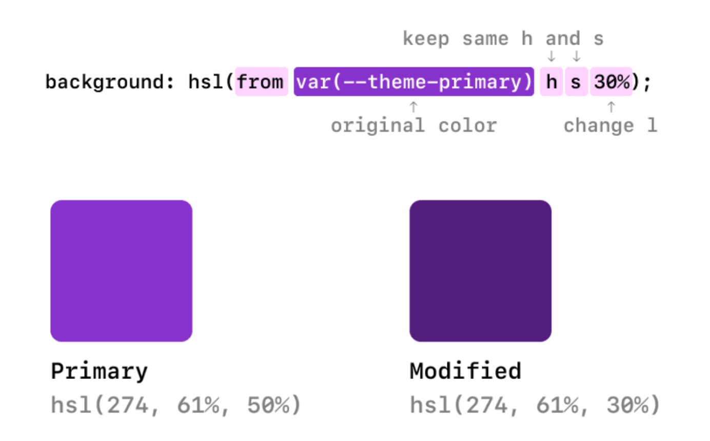
- To begin customizing the colors of your WordPress theme, you need to understand the basics of CSS. CSS (Cascading Style Sheets) is a styling language used to describe the look and formatting of a document written in HTML. By targeting specific elements or classes in your CSS code, you can modify the colors of various elements such as headings, paragraphs, links, buttons, and more.
- In addition to colors, backgrounds play a significant role in creating a visually appealing website. Whether you want to add a background color, an image, or a pattern, understanding how to manipulate backgrounds in your WordPress theme is essential. You will learn how to set different background properties, including background-color, background-image, background-repeat, and background-size, to achieve the desired effect.
- Throughout this chapter, we will explore common CSS issues related to colors and backgrounds and provide you with step-by-step solutions. You will learn how to troubleshoot and fix color conflicts, adjust background images to fit the screen, create gradient backgrounds, and more. We will also introduce some useful tools and resources that can assist you in customizing colors and backgrounds effortlessly.
By the end of this chapter, you will have the knowledge and skills to effectively customize colors and backgrounds in your WordPress theme, allowing you to create visually stunning websites that captivate your audience. Whether you are a seasoned web developer or a novice web owner, this comprehensive guide will be an invaluable resource in your journey to master CSS and enhance the visual appeal of your WordPress themes.
Modifying Fonts and Typography
In the world of web development, the aesthetic appeal of a website holds immense importance. One crucial aspect that contributes to the visual appeal is the typography and font selection. Choosing the right fonts and modifying them to fit your WordPress theme can make a significant difference in the overall user experience. In this chapter, we will explore various techniques and solutions to modify fonts and typography for your WordPress themes, helping you create visually stunning and unique websites.
- For web developers, understanding the basics of CSS (Cascading Style Sheets) is essential. We will delve into the intricacies of CSS and provide you with practical solutions to fix common WordPress theme CSS issues related to fonts and typography. Whether you want to change the font family, size, color, or spacing, this chapter will equip you with the necessary tools and techniques.
- Newbie web owners often face challenges when it comes to customizing their WordPress themes. With the help of this subchapter, you’ll gain a comprehensive understanding of how to modify fonts and typography without relying solely on pre-designed theme options. You’ll discover how to create a unique website that aligns with your brand identity and vision.
- We will cover various methods to modify fonts and typography, including utilizing Google Fonts, integrating Adobe Fonts, and self-hosting custom fonts. You’ll learn how to apply these fonts to different sections of your website, such as headings, paragraphs, menus, and widgets. Additionally, we will discuss the importance of responsive typography and how to ensure your fonts look great across different devices and screen sizes.
- Throughout this chapter, we will provide step-by-step instructions, practical examples, and real-life scenarios to help you grasp the concepts effectively. You’ll also find troubleshooting tips and best practices to overcome any challenges you may encounter during the font modification process.
By the end of this chapter, you’ll have the skills and knowledge to confidently modify fonts and typography in your WordPress themes. Whether you’re a seasoned web developer or a newbie web owner, this guide will empower you to create visually appealing websites that leave a lasting impression on your audience.
Adjusting Margins, Padding, and Borders
In this chapter, we will delve into the world of adjusting margins, padding, and borders in CSS. As a web developer or newbie web owner, you often encounter issues with the layout and design of your WordPress themes. Fear not, for this comprehensive guide will equip you with the necessary knowledge and skills to tackle these challenges head-on.
Margins, padding, and borders play a crucial role in creating a visually appealing and well-structured website. They control the spacing between elements, define the area around content, and add a touch of elegance with borders. However, improper adjustment of these properties can lead to a jumbled and unprofessional-looking website.
We will start by exploring margins, which control the space outside an element. Understanding how to adjust margins will help you fine-tune the spacing between different sections of your website, ensuring a clean and organized layout. We will discuss various techniques to set margins, such as using shorthand properties, percentage values, and auto margins.
Next, we will delve into padding, which defines the space between an element’s content and its border. You will learn how to add padding to specific sides of an element or apply it uniformly on all sides. Mastering padding will enable you to create consistent spacing within your website’s elements, making it more visually appealing and easier to navigate.
Lastly, we will explore borders, which provide structure and visual hierarchy to your website. You will discover how to customize borders by adjusting their width, style, and color. We will also cover advanced techniques, such as creating rounded corners and applying multiple borders to an element, to add a touch of uniqueness to your designs.
Whether you are a seasoned web developer or a newbie web owner, adjusting margins, padding, and borders is a crucial skill to master. With the knowledge gained from this subchapter, you will be equipped to create visually stunning and well-structured WordPress themes, taking your website to the next level. So, let’s dive into the world of adjusting margins, padding, and borders and unlock the full potential of your website’s design!
Creating Responsive Layouts with CSS Grid and Flexbox
In today’s digital age, it’s crucial for websites to be responsive and adaptable to various screen sizes. With the increasing number of users accessing the internet through different devices, web developers need to ensure that their WordPress themes have responsive layouts. This chapter will guide you on how to create responsive layouts using CSS Grid and Flexbox, two powerful tools that can revolutionize your WordPress theme development.
CSS Grid is a two-dimensional layout system that allows you to create complex grid structures for your website. With CSS Grid, you can easily divide your web page into rows and columns, making it easier to align and position elements. This tool provides you with the flexibility to create responsive layouts that automatically adjust based on the available screen space. By utilizing CSS Grid, you can efficiently organize and structure your website’s content, ensuring a seamless user experience across different devices.
Flexbox, on the other hand, is a one-dimensional layout system that allows you to create flexible and responsive layouts. With Flexbox, you have control over the alignment, direction, order, and size of elements within a container. It simplifies the process of creating responsive designs by providing powerful alignment and distribution capabilities. By utilizing Flexbox, you can easily create multi-column layouts, evenly distribute space between elements, and align items within containers, all without the need for complex calculations and positioning.
In this chapter, we will walk you through the step-by-step process of implementing CSS Grid and Flexbox in your WordPress themes. We will discuss the basic concepts of each tool, provide practical examples, and guide you on how to integrate them into your existing themes. Whether you are a seasoned web developer or a newbie web owner, this comprehensive guide will equip you with the knowledge and skills required to fix WordPress theme CSS issues and create responsive layouts that adapt to various screen sizes.
By following the techniques outlined in this subchapter, you’ll be able to enhance the user experience of your website, improve its accessibility, and ensure that your WordPress themes are compatible with different devices. With CSS Grid and Flexbox, you can create visually stunning and functional layouts that captivate your audience and elevate your online presence. So, dive into this subchapter and unlock the power of CSS Grid and Flexbox for your WordPress themes today!
Adding Animations and Transitions
In this chapter, we will explore the fascinating world of animations and transitions in CSS. Whether you are a web developer looking to enhance your WordPress themes or a newbie web owner seeking to fix CSS issues, this comprehensive guide is designed to help you make your website more visually appealing and engaging.
Animations and transitions can breathe life into your website by adding movement and interactivity. They allow you to create smooth and seamless effects that captivate your visitors and enhance their overall user experience. With CSS, you have the power to animate various elements such as text, images, buttons, and even entire sections of your WordPress theme.
First, we will delve into the basics of CSS animations. You will learn how to define keyframes and apply them to elements using simple CSS properties. We will also cover the different animation properties and their values, enabling you to control the timing, duration, and easing of your animations.
Transitions, on the other hand, provide a smooth change in property values over a specified duration. We will guide you through the process of adding transitions to various elements, allowing you to create eye-catching effects when hovering over or interacting with specific elements on your WordPress theme.
In this chapter, we will also address some common CSS issues that web developers and newbie web owners face when implementing animations and transitions. From troubleshooting conflicting CSS rules to ensuring cross-browser compatibility, we will provide practical solutions and tips to help you overcome these challenges.
Enhancing your WordPress theme with animations and transitions not only adds an aesthetic appeal but also improves user engagement and interaction. By incorporating these dynamic effects, you can effectively communicate information, guide user attention, and make your website stand out in the vast digital landscape.
Whether you are a seasoned web developer or a newbie web owner, the insights and techniques shared in this subchapter will equip you with the knowledge and skills to add animations and transitions to your WordPress themes successfully. Get ready to transform your website into a visually stunning and captivating experience for your visitors.
We fix, host, & maintain WordPress websites
At wpmaintenanceservice.com we provide instant WordPress technical support. We also provide bespoke web hosting & expert management for thousands of WordPress websites. Use us for quick one-time fixes, or partner with us for ongoing WordPress website maintenance.
Required assistance locating a hosting web option that benefits you? Contact us